The key to creating compelling live visuals isn’t learning to code, but translating your existing musical intuition into a visual language.
- Treat visual software like a Digital Audio Workstation (DAW), mapping audio signals to visual parameters just like an effects chain.
- Use music theory to guide your color choices, ensuring your visuals are in key with your sound.
- Design a « performance dashboard » with a MIDI controller to play your visuals like an instrument.
Recommendation: Start with a single concept, like mapping your kick drum to a simple shape’s pulse, and build your visual synthesizer one « patch » at a time.
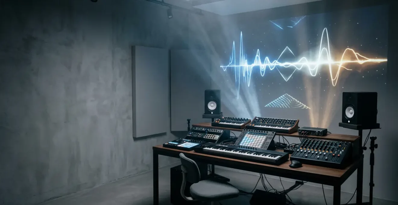
As a musician, you live and breathe sound. You sculpt frequencies, shape dynamics, and build worlds with harmony and rhythm. But what happens when the sound isn’t enough? You see colors when you hear chords, you feel shapes in the beat, and you have a burning desire to make the audience see what you hear. The common advice is to dive into complex software or hire a VJ, but this often feels like learning a foreign language, disconnected from your creative process. You’re told to learn coding, understand video codecs, and manage complex hardware, pulling you away from what you do best: making music.
The barrier to entry seems impossibly high, filled with technical jargon and abstract programming concepts. Many musicians try and quickly retreat, frustrated that the tools don’t « think » like they do. They grapple with software that feels more like a spreadsheet than an instrument. The standard approach of simply linking bass to size and snares to flashes produces clichéd, uninspired results that feel detached from the music’s soul. This creates a gap between your sonic vision and your visual output, leaving you with visuals that merely accompany the music instead of being an integral part of it.
But what if the secret wasn’t to become a programmer, but to approach visuals as an extension of your musicianship? What if you could use your deep understanding of signal flow, envelopes, and macros to build a visual instrument that is as expressive and playable as your synthesizer? This guide reframes the entire process. We will translate the intimidating world of real-time visuals into the language you already speak. We will explore how to think about visual nodes as an effects chain, how to sync light with the precision of a drum machine, and how to build a performance rig that is as reliable as your favorite guitar pedal. It’s time to stop coding and start designing sound for the eyes.
This article provides a complete roadmap for musicians ready to take control of their live visuals. From choosing the right software paradigm to designing a tour-proof system, each section builds on your existing skills to unlock your visual potential.
Summary: How to Create Visuals That React to Audio Frequencies in Real-Time?
- Node-Based or Code: Is TouchDesigner Too Hard for Musicians?
- DMX or MIDI: How to Sync Your Lights to Your Drum Machine?
- Flat Screen or 3D Object: Getting Started with Projection Mapping?
- The Color Palette Mistake That Clashes with the Musical Key
- Sequencing & Planning: Building a Portable VJ Rig for Touring
- Problem & Solution: Looking Good in Bad Club Lighting
- How to Map Macros for Live Performance Without Touching the Laptop?
- How to Design Sound Installations That Transform Public Spaces?
Node-Based or Code: Is TouchDesigner Too Hard for Musicians?
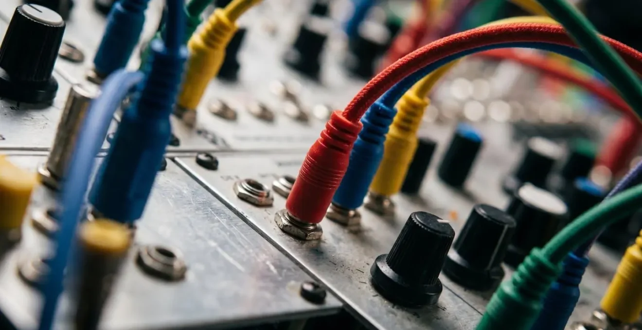
The biggest hurdle for any musician entering the world of visuals is the software itself. The debate often boils down to code-heavy platforms versus node-based environments like TouchDesigner. The fear is that « visual programming » is just coding with boxes and wires—a perception that is fundamentally misleading. For a musician, a node-based workflow is the most intuitive system imaginable because you already use it every day. Think of your DAW’s mixer or a modular synthesizer: you route an audio source through a chain of effects (EQ, reverb, compression) to an output. TouchDesigner operates on the exact same principle of signal flow.
An « Audio In » operator is your microphone or soundcard input. An « Analyze » operator is your EQ, splitting the sound into frequency bands. A « Geometry » operator is your oscillator, creating a shape. And a « Render » operator is your master output, sending the final image to a projector. This is your native language. The learning curve isn’t about learning to code; it’s about translating your knowledge of audio signal chains into a visual domain. This approach is confirmed by a collaboration between Ableton and visual artists, which highlighted how TouchDesigner was created for artists working with image, light, and sound, making it inherently musician-friendly. As artist Bileam Tschepe noted, it’s the perfect tool for turning the abstract forms you see when listening to music into reality.
The true power emerges when you stop thinking in terms of programming and start thinking like a sound designer. You can create visual ADSR envelopes by connecting audio analysis data (like a kick drum’s transient) to parameters, giving your visuals the same organic attack, decay, sustain, and release as a synth patch. Python scripting should be seen as a « power-up, » not a requirement—a tool to be used selectively for complex logic that would be cumbersome with nodes, much like using a custom Max for Live device for a specific task. By viewing it as a visual synthesizer, TouchDesigner becomes an extension of your existing creative process, not a daunting technical obstacle.
Your Workflow: From DAW Concepts to TouchDesigner Nodes
- Map your existing DAW signal flow (audio input → effects chain → output) to TouchDesigner’s data flow structure (audio analysis → visual operators → renderer).
- Start with the Audio Device In CHOP to bring sound into your project, treating it like routing audio to a track in your DAW.
- Use the Audio Analysis tool from TouchDesigner’s palette to extract frequency bands, amplitude envelopes, and beat detection—think of these as visual ‘sends’ from your audio.
- Introduce Python scripting selectively for complex logic (state changes, musical scale mapping) that would require dozens of nodes—use code as a ‘power-up’, not a replacement.
- Build visual ‘ADSR envelopes’ by connecting audio analysis data to parameter controllers, creating the same attack-decay-sustain-release curves you use for synthesizer patches.
DMX or MIDI: How to Sync Your Lights to Your Drum Machine?
Once you’re generating visuals, the next frontier is making the physical world react: your lights. For a musician, especially a drummer or electronic artist, the goal is perfect, tight synchronization. The two main languages for this are MIDI and DMX. While both can control lights, they are designed for fundamentally different purposes, and choosing the right one is critical for percussive « feel. » MIDI is the language of musical performance; DMX is the language of theatrical lighting. The key is to find the best way to translate one into the other.
MIDI, especially the classic 5-pin DIN connection, offers extremely low latency, making it ideal for triggering events in perfect time with a drum hit. However, its control resolution is limited (typically 7-bit, or 0-127), which can feel coarse for smooth fades. DMX, on the other hand, is built for lighting fixtures, offering higher resolution (8-bit, or 0-255) and a robust protocol designed to control hundreds of lights reliably. The challenge is that your drum machine speaks MIDI, not DMX. This is where a MIDI-to-DMX bridge becomes the most important part of your rig. This hardware device acts as a real-time translator, taking a MIDI note from your drum machine’s sequencer and converting it into a DMX command that a specific light fixture understands.
A real-world example demonstrates this perfectly. During a year-long tour, the band The Dreaming used a DecaBox interface to sync their light show directly with the drummer’s performance. MIDI notes programmed in ProTools were sent to the DecaBox, which translated them into DMX signals for 16 lighting fixtures. The kick drum triggered blinders, the snare controlled LED panels, and the velocity of each hit directly controlled the brightness. This allowed for an arena-level, perfectly synced light show in small clubs, with a setup time of under 10 minutes once the MIDI was programmed. This approach combines the rhythmic precision of a DAW with the industrial power of DMX.
To make an informed decision, it’s essential to compare the protocols based on the specific demands of a live music environment. The following table breaks down the key factors for synchronizing percussive lighting.
| Factor | MIDI (USB) | MIDI (DIN 5-pin) | DMX512 | Art-Net/sACN |
|---|---|---|---|---|
| Latency (Typical) | 5-15ms | 1-3ms | 1-2ms | 3-8ms (network dependent) |
| Max Update Rate | 1000 Hz (USB) | 31.25 kbps | 40 Hz (DMX standard) | 40-44 Hz |
| Best For | Studio sync with DAW | Live percussive triggers | Direct fixture control | Complex multi-universe setups |
| Velocity/Intensity Mapping | 0-127 (7-bit) | 0-127 (7-bit) | 0-255 (8-bit) | 0-255 (8-bit) |
| Cable Length Limit | 5m (passive) | 15m (spec), 50m+ (practice) | 300m (with boosters) | 100m (Cat5/6 ethernet) |
Flat Screen or 3D Object: Getting Started with Projection Mapping?
Projection mapping is the art of turning any surface—a building, a stage set, or a simple object—into a dynamic video display. For a musician, it’s a way to break free from the rectangle of a TV screen and make your visuals inhabit the physical space you perform in. The immediate assumption is that this requires complex 3D modeling and expensive scanners, but the entry point is far more accessible. The key is to start with what’s called « 2.5D » mapping: projecting onto near-flat surfaces that have some depth and texture, like a stack of white boxes or a textured wall. This creates powerful illusions of depth without the headache of a full 3D workflow.
Getting started is surprisingly budget-friendly. The barrier to entry has been dramatically lowered as most professional software tools now offer free versions for personal use. A 2025 industry overview confirms that TouchDesigner, MadMapper, and Resolume all offer free versions, making the technology highly accessible for artists to learn without financial commitment. You can begin with a basic HD projector (720p with at least 2000 lumens is a good starting point), your laptop, and some simple white surfaces. The most powerful beginner technique is to use the projector itself as a scanning tool. By projecting a grid onto your object and taking a photo from the projector’s exact location, you can trace accurate digital « masks » in your software to isolate different parts of the object.
For alignment, all major mapping software includes a feature called corner-pinning or « quad mapping. » This allows you to manually drag the four corners of your video content to match the four corners of the real-world surface you’re projecting onto. This hands-on, tactile approach is perfect for musicians who are used to tweaking knobs and faders to get the right feel. It turns the complex process of calibration into a simple, intuitive task of visual alignment. By starting small with 2.5D surfaces and manual alignment, you build a foundational understanding of how light interacts with form, paving the way for more complex 3D projects in the future.
Action Plan: Your Budget-Friendly DIY Projection Mapping Setup
- Equipment: Acquire at minimum an HD (720p) projector with 2000+ lumens, a computer capable of running mapping software, and simple white or textured surfaces to start (avoid complex 3D objects initially).
- Software Setup: Download free options like TouchDesigner (non-commercial license) or use trial versions of MadMapper to learn interface basics without financial commitment.
- Surface Analysis: Begin with ‘2.5D’ mapping—near-flat surfaces with subtle texture like textured walls or simple white boxes arranged in layers—to create compelling depth illusions before tackling full 3D models.
- DIY Scanning Method: Use your projector itself as a measurement tool—project a test grid onto your object and photograph it from the projector’s position to trace accurate masks without expensive 3D scanners.
- Alignment Technique: Leverage software corner-pinning features (available in MadMapper and Resolume) to manually align projected content by adjusting corner points, ideal for beginners before learning advanced calibration.
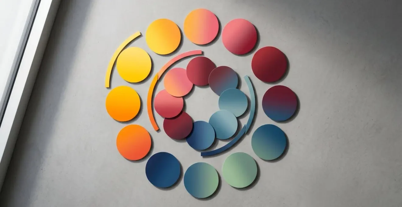
The Color Palette Mistake That Clashes with the Musical Key
One of the most common mistakes in audio-reactive visuals is a chaotic or arbitrary use of color. A frenetic rainbow of hues flashing on screen can quickly become distracting and emotionally disconnected from the music. The solution lies in a concept you already master: harmony. Just as a musical key provides a framework of notes that work well together, a well-chosen color palette creates visual harmony. The most powerful approach is to link the emotional quality of your music to the emotional quality of colors. This isn’t just an abstract idea; it’s backed by science.
Studies have shown that even for people without synesthesia, there are universal connections between music and color. As researcher Karen Schloss noted in a study published in Proceedings of the National Academy of Sciences, « common emotions are responsible for music-to-color associations. » Fast-paced music in a major key tends to be associated with lighter, more saturated, warm colors like yellow, while slower, minor-key music evokes darker, desaturated, cool colors like blue and grey. This gives you a direct, evidence-based framework: a C major chord and a G major chord should live in a similar color « world, » while a shift to A minor should trigger a corresponding shift in the visual palette.
Further research into synesthesia provides an even more detailed model. A 2017 study in Nature Scientific Reports found a systematic relationship between musical pitch and color. It revealed that pitch height (how high or low a note is) correlates with brightness, while the pitch class (the note itself, e.g., C, D, E) maps to hue and saturation. This gives you a complete music-to-color translation model in the HSV (Hue, Saturation, Value) color space, which is a standard feature in all visual software. Instead of randomly assigning colors, you can map the key of your song to a base hue, the intensity of your performance to saturation, and the primary melody’s pitch to brightness. This creates a cohesive, deeply integrated visual experience where the colors are not just reacting to the sound, but are truly in key with it.
Scientific Study: Pitch Classes Have Rainbow Hues in Synesthesia
A 2017 Nature Scientific Reports study analyzed 15 individuals with pitch class-color synesthesia and discovered systematic crossmodal correspondences: pitch classes mapped to rainbow hues across the color spectrum, with ‘do/re/mi’ evoking highly saturated warm colors while ‘la/si’ produced less saturated, muted tones. The research revealed that despite individual differences, there exists a latent, structured relationship between musical pitch and the hue dimension of color. The study also found that pitch height correlates with brightness/value, while pitch class maps to hue and saturation—creating a complete model for music-to-color translation in the HSV color space.
Sequencing & Planning: Building a Portable VJ Rig for Touring
Taking your visual show on the road introduces a whole new set of challenges that mirror the life of a touring musician: reliability, portability, and quick setup are paramount. A crash mid-song is not an option. Building a robust touring VJ rig requires a strategic balance between creative flexibility and bulletproof stability. The central decision you’ll face is the ratio of real-time generative content versus pre-rendered video clips. Generative visuals, created on the fly by software like TouchDesigner, offer incredible flexibility to react to the music and the energy of the room. However, they are CPU/GPU intensive and have more potential points of failure (software bugs, driver updates, etc.).
Pre-rendered clips, on the other hand, are video files that you create ahead of time. They are extremely reliable and have a very low processing overhead—your computer is just playing a video. The trade-off is a complete lack of flexibility; they are fixed and cannot react to improvisation. The professional solution is a hybrid approach. A common strategy is to use generative visuals as the main engine for about 60% of your show, providing the live, interactive core. The remaining 40% consists of pre-rendered clips that serve as a « safety net. » These can be used for song intros, transitions, or as a stable backup to switch to instantly if your generative system ever falters.
Beyond content strategy, a touring rig demands a musician’s mindset towards redundancy. You wouldn’t tour without backup guitar strings or a spare cable, and your visual rig should be no different. The most common point of failure on the road is not the computer, but a simple cable. Always carry duplicates of every essential cable: HDMI, USB, and power. For ultimate peace of mind, a « panic button » is a non-negotiable. This is a dedicated button on your MIDI controller programmed to do one thing: instantly switch from your complex, resource-heavy generative patch to a simple, stable, pre-rendered video loop. It’s your get-out-of-jail-free card that ensures the show goes on, no matter what.
This table outlines the strategic trade-offs between the two content types, providing a framework for planning your touring set.
| Factor | Real-Time Generative Visuals | Pre-Rendered Video Clips |
|---|---|---|
| CPU/GPU Load | High (continuous processing) | Low (playback only) |
| Reliability on Tour | Medium (driver/hardware dependencies) | High (fewer points of failure) |
| Creative Flexibility | High (responsive to live audio input) | Low (fixed timing and content) |
| File Size/Storage | Small (project files only) | Large (video codecs) |
| Best Use Case | Interactive performances, improv sets | Synchronized productions, backup content |
| Recommended Ratio | 60% (main visual engine) | 40% (safety net + transitions) |
Problem & Solution: Looking Good in Bad Club Lighting
You’ve spent weeks crafting beautiful, intricate visuals, but you get to the venue and disaster strikes. The club’s own lighting is a chaotic wash of saturated color, the haze machine is blasting, and your carefully designed visuals are completely washed out and illegible. This is one of the most common and frustrating problems for a performing VJ. The solution is not to fight the environment, but to design for it. The key is to embrace high-contrast, minimalist design that can cut through the noise.
In a visually chaotic environment, complexity is your enemy. Intricate patterns and subtle color gradients will be the first things to disappear. Instead, you must think in terms of negative space and bold forms. A visual that is 60% or more pure black, with sharp, white geometric outlines, will have far more impact than a fully rendered, colorful scene. The black space gives the eye a place to rest and makes the white elements « pop » against the ambient light. Similarly, you must adopt a strict, limited color palette. Forget gradients; stick to a maximum of two highly saturated primary colors (like pure cyan and pure magenta) plus white. These raw colors have the best chance of holding their own against unpredictable LED wash lights.
Finally, you need to see the venue’s « problems » as assets. Is the air thick with haze? Excellent. Design visuals with strong beam-like effects and volumetric rays. These will catch the haze particles and turn your 2D projection into a 3D light sculpture that fills the room, making the atmosphere an integral part of your work. If the house lights are unexpectedly bright, use a contrast inversion technique. Instead of your usual light-on-dark visuals, switch to dark-on-light. A black moving shape on a bright white background can maintain its readability and impact even when the stage is flooded with light. It’s a counterintuitive approach that works by creating local contrast, ensuring your art is always seen.
High-Contrast Visual Strategy for Saturated Lighting Environments
- Negative Space Design: Create visuals with 60%+ black/empty space and high-contrast white or single-color geometric outlines—these cut through chaotic ambient lighting better than filled shapes.
- Limited Palette Rule: Restrict your color palette to a maximum of 2 highly saturated primary colors (e.g., pure cyan + pure magenta) plus white—complex gradients and pastel tones get completely washed out by LED wash fixtures.
- Line Weight Optimization: Use thick stroke weights (minimum 10-15 pixels at 1080p resolution) for any geometric outlines or typography—thin lines disappear in haze and competing light sources.
- Volumetric Integration: Embrace venue haze as an asset—design beam-like effects and light rays in your visuals that interact with atmospheric haze to create 3D light sculptures visible throughout the space.
- Contrast Inversion Technique: When venue lighting is bright, invert your visuals to dark-on-light rather than light-on-dark—this counterintuitive approach maintains readability by creating local contrast against bright backgrounds.
How to Map Macros for Live Performance Without Touching the Laptop?
The goal of any live performance is to be in the moment, connected with the music and the audience. The last thing you want is to be staring at a laptop screen, clicking with a mouse. To make your visual set truly playable, you need to translate its controls onto a physical interface: your MIDI controller. This isn’t just about mapping one button to one effect; it’s about designing a « performance dashboard » that is ergonomic, intuitive, and allows for complex, expressive control with simple physical gestures.
The core principle is « one-to-many » mapping. A single knob or fader on your controller should influence multiple visual parameters simultaneously, creating rich, organic changes. For example, a « master intensity » knob might not only control the overall brightness but also slightly increase a blur effect and decrease color saturation as it’s turned down. This philosophy was masterfully executed by lighting designer Nick Foligno for the band Yeasayer’s tour. Using an Akai APC40, a single knob could simultaneously control brightness, color temperature, and strobe speed, allowing for complex transitions from a single gesture. The system, built with Lightjams software, mapped MIDI messages from the band’s DAW directly to lighting parameters, effectively turning the controller into a dynamic, expressive instrument for light.
Designing your controller layout is like arranging your pedalboard—it needs to make sense spatially. A strategic approach is to create functional zones: faders on the left for intensity and opacity, knobs in the center for color and texture, and pads on the right for triggering scenes or effects. This builds muscle memory, so you’re not searching for the right control mid-song. Most importantly, you must program your controller’s LEDs to provide visual feedback. A button should light up when an effect is active and turn off when it’s not. This closed-loop system is critical; it lets you know the state of your visuals without ever looking at the laptop, keeping your head up and your focus on the performance.
Real-World MIDI Mapping Setup: Lighting Designer Nick Foligno’s Workflow
Brooklyn-based lighting designer Nick Foligno created a performance system for Yeasayer’s 2016 tour where an Akai APC40 MIDI controller triggered lighting cues. The system used Lightjams software to map MIDI messages to visual parameters, with the band modifying scenes directly in their DAW. This ‘one-to-many’ mapping philosophy allowed a single knob to simultaneously control brightness, color temperature, and strobe speed—creating complex organic transitions from simple physical gestures while keeping hands free to perform.
Key Takeaways
- Think of visual software like a DAW; your existing knowledge of signal flow is your biggest asset.
- Use music theory to inform your color palettes, creating visual harmony that is emotionally connected to the sound.
- Build a « performance dashboard » on a MIDI controller to make your visuals as playable and expressive as a musical instrument.
How to Design Sound Installations That Transform Public Spaces?
Taking your audio-visual skills beyond the stage and into the realm of public art installations presents a new and exciting challenge. Unlike a one-night performance, an installation must run unattended for weeks or months, enduring weather, public interaction, and potential vandalism. This shifts the focus from pure creative expression to durability engineering and systemic resilience. Your primary goal is to build a system that is as close to indestructible and self-sufficient as possible.
The first line of defense is physical protection. All electronics—computers, power supplies, interfaces—must be housed in NEMA-rated enclosures. These are industrial-grade boxes that protect against dust and water (an IP65 rating is a minimum for outdoor use). For any surface the public might touch, standard acrylic is a liability. You must use polycarbonate (often sold under the brand name Lexan), a material that is 250 times stronger than glass and will resist impacts that would shatter other plastics. These material choices are non-negotiable for any unattended public work.
The second pillar of a durable installation is remote management and automated recovery. No matter how well you build it, software will eventually crash. You cannot afford to drive to the site every time there’s a glitch. An auto-reboot system is your most powerful tool. This can be a hardware « watchdog timer » or a smart power strip that pings the computer’s IP address every few minutes. If it doesn’t get a response, it automatically power-cycles the system, a fix that solves the vast majority of common crashes. This should be paired with remote VPN access and a strategically placed IP camera, allowing you to log in, see what’s happening, and diagnose problems from your studio. For high-stakes projects, a master/slave dual-computer setup with automatic failover ensures 100% uptime, cementing your reputation as a reliable professional artist.
Durability Engineering for Unattended Public Installations
- Weatherproofing Electronics: House all computing hardware in NEMA-rated enclosures (minimum IP65 for outdoor use) with active cooling and filtration to prevent dust.
- Vandal-Proof Materials: Use polycarbonate (Lexan) instead of acrylic for all physical interfaces or protective surfaces to resist impacts.
- Auto-Reboot System: Configure a hardware watchdog timer that automatically power-cycles the system if it becomes unresponsive, solving most crashes remotely.
- Remote Monitoring Setup: Implement VPN access with remote desktop software and IP cameras to diagnose issues without site visits.
- Component Redundancy: Run dual computers in a master/slave configuration with automatic failover to ensure 24/7 uptime for public-facing installations.
By reframing technology through the lens of musicianship, you transform a daunting technical challenge into a natural extension of your creative voice. The principles of signal flow, harmony, performance, and reliability are the universal language that connects sound and sight. Start today by applying these concepts, and begin sculpting light with the same intention and passion you apply to sound.